By Anne Holland, President
Last May, I told you about MarketingSherpa's eye-tracking study of how online shoppers "see" a site home page, such as Wal-Mart's home page http://www.marketingsherpa.com/article.php?ident=29910. The biggest results?
No matter how pretty and enticing the rest of the page, most shoppers seemed to focus on navigation such as search boxes and nav bars. They were on a quest, and the rest of your site design was ignored. Now, you can draw a heck of a lot of conclusions from this that might cause you to radically revamp your home page.
But before suggesting that anyone radically redesign, I wanted to get more data. So, this January, in partnership with Guidester, MarketingSherpa's research team conducted a new study on Internet retailer home pages. In this case, we went straight to the horses' mouth -- we asked 428 adult consumers what they do when they visit an ecommerce site.
Here’s what they told us:
Chart: What’s the First Thing Consumers Do When They Arrive at a Retail Site?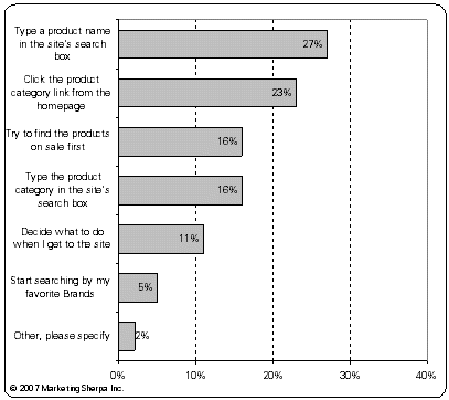 Source: MarketingSherpa and Guidester, Online Shopping Research Survey, January 2007
Methodology: MarketingSherpa surveyed an audience of online Americans in January 2007 via Guidester and received 428 responses from adults who were nationally representative.If you do the math, the biggest two chunks of activity are using the site search box -- at 43% -- or clicking on straightforward navigation, such as tabs, menus and sales hotlinks, at 39%.
Together, that's an overwhelming 82% who go directly to navigational elements rather than "browsing."
This reminds me of male shoppers in the real world. You know how men are … they treat going to most stores as a Procurement Expedition. They enter with their shopping goal firmly in mind, glance about quickly to establish which aisle the item is in, march down the aisle looking neither left nor right, grab the item in question and then march firmly to checkout and exit.
They don't browse. They don't particularly enjoy the shopping experience or stretch it out to have some fun. It's not entertainment. It's a task to accomplish as efficiently as possible.
Many women, on the other hand, treat shopping in the offline world as relaxation. I know I'm not the only woman who lulls herself to sleep at night with a nice new juicy catalog by her bed! Shopping with no direct purpose in mind can be sheer pleasure for us. Often, it's just window shopping, but that's where purchase goals are born, why savings are begun and when brand loyalty grows from dreams of acquisition.
The fact is, though, that both of our online shopper studies, along with much anecdotal Case Study evidence, indicate this type of browsing for the sake of entertainment -- shopping equaling a pleasurable activity -- just isn't happening much online yet.
Is it because the real world is better for browsing or because marketers haven't learned how to design browse-worthy site experiences yet? No matter the answer, here are the three actions I think most sites should consider in light of this evidence:
#1. Focus your home page on navigation more
There's a trend in big brand sites -- especially those who are selling based on brand rather than solely on price -- to dedicate the center of their home page to brand images and/or very large hero shots. This is also a big trend in B-to-B non-ecommerce Web sites.
The navigational elements are pushed to the edges of the screen, across the top, down the left hand edge and down below the fold. Instead, starring in the center of the home page, you'll see a big photo, a big block of color, often with text headline running across it. It's almost more inspired by a printed ad than an interactive experience. And, based on our research, it's almost certainly ignored by most visitors. Congratulations, you've just turned your home page into a big branded dead spot.
If you add more navigational elements to the center of your home page -- anything from hotlinked buttons to underlined blue text links -- you may see better traction. In short: treat your home page more as a site map and less as a brand building advertisement.
#2. Improve your internal site search
If you don’t spend as much time tweaking your internal search functionality and design as you do your home page marketing efforts, you’re missing out. Six factors I recommend testing on search results landing pages as soon as possible are:
A. Number of answers displayed
B. Horizontal vs vertical display
C. Broadness of answers (i.e., search result explicitness)
D. Relevancy of top answers
E. Size of images
F. Copy including price/offer
Biggest key -- if a shopper makes a typo in your internal search box or searches for something you do offer, but by a slightly different name than you call it (i.e., "coat" versus "outerwear"), what will your search results present to them? For sites big and small, the answer can be an embarrassing "Zero Results."
#3. Test your category pages' conversion capabilities
Your category pages, where a shopper lands if they search for a general search term or if they click on a main nav bar link or tab, are the next most critical pages to evaluate.
Many marketers focus on the merchandising and design of an individual product page far more than they look at the category pages that drove the traffic there. In fact, for many sites the category pages are created by default -- the layout is whatever the Web design team decided in their wireframe meeting years ago, without much testing or thought from that point forward.
Now it's time to test that page layout. Consider your category pages as if they are home pages themselves -- which they are really. Each one is the home page of a microsite within your site that's dedicated to a particular topic. How can you make them easier to navigate? How can you add more clickable elements such as sale hotlinks and dedicated search boxes?
If you're interested in ecommerce category page design, we have a new study out on this topic. See the link below for more info on that. And. please let me know what your test results have been in this area … I'd love to share lessons learned with the marketing community!
Useful links related to this article2007 Ecommerce Benchmark Guide:
http://www.sherpastore.com/e-commerce-benchmark.html?8966


