

|
SUMMARY:
Google is deprioritizing sites with intrusive, unsolicited modals on mobile. It’s looking for sites that have a modal that happens after a certain amount of time or scroll distance; sites that block the user from seeing the main content before the modal/interstitial; and sites that trick the user into thinking they are looking at the main content, but it’s really a modal. It’s not that modals can’t be used, or take up a large amount of the screen, but the user should be the reason the modal happened and there should be a clear way out of the modal. Here’s how we built a modal for the mobile version of the MarketingSherpa website that conforms to these restrictions. |
There is a famous experiment known as The Invisible Gorilla. And it’s a major challenge for marketers.
In the experiment at Harvard University, Dr. Christopher Chabris and Dr. Daniel Simons asked people to count the number of times a basketball was passed back and forth in a video. In the middle of the video, a person dressed in a gorilla suit walks right into the frame, pounds his chest, and walks off. Half of the people who watched the video and counted the passes never even noticed the gorilla.

This is a psychological phenomenon known as selective attention. And frankly, it’s vital for human survival, especially in the modern world. As I type this, there is a murmur of colleagues talking in the distance, I see people walking by my office out of the corner of my eye, I occasionally hear the siren of an ambulance taking a patient to the Mayo Clinic Emergency Room across the street, and there are countless other sensory inputs. We simply can’t take in all the information around us and be able to function.
Banner blindness
While necessary for human survival, this poses a challenge for marketers. Selective attention is the reason for banner blindness.
There are multiple ways to overcome this phenomenon. You can create a more effective banner ad. You can utilize content marketing so the message is baked into their focal point, the main reason they are coming to your site.
But another tactic that can be effective can also be controversial — the popup/modal/interstitial. Something to stop visitors in their tracks and make sure they see your call-to-action (with an easy way to dismiss it).
This tactic can be controversial because it can negatively impact the customer experience (so you should monitor for negative effects when launching a modal), but it can also be a very effective way to get your visitors’ attention. Some examples:
B2B Marketing: Pop-ups outperform email by 643% to drive survey responses
Online Testing: How a pop-up chat test increased conversion 120%
Landing Page Optimization: Simple pop-up overlay increases conversion 63%
A modal on mobile
Even if you decide to go with a modal box on the desktop version of your website to grab visitors’ attention, there are very good reasons not to have a modal or interstitial that covers the full screen of mobile devices. For one, since mobile can load slower, a mobile modal can be a more disruptive experience. Another serious concern is that mobile modals can hurt SEO.
So what is a marketer to do? You’ve determined that you need a way to overcome selective attention but don’t want to shoot your mobile site in the foot.
We recently faced this challenge on our own websites, so here are some tips and design options the MECLABS Institute Design team came up with to overcome the challenge (MECLABS is the parent research organization of MarketingSherpa). Hopefully, they give you some ideas for your own mobile modals, if you choose to go that route.
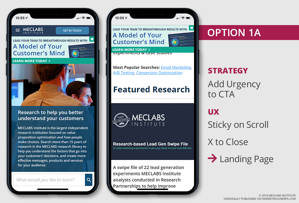
Option #1: Sticky banner
The first option our design team came up with was a sticky banner. “Sticky” means that when visitors scroll down on the page, the banner would stay at the top. For some of our websites, the nav was sticky and stayed at the top of the screen as people scrolled down.
“We want to be cognizant of how much of the smartphone’s viewport is covered. If both are sticky, they would cover up almost a quarter of the screen,” said Lauren Leonard, Associate Director of Design, MECLABS Institute. So for this idea, only the banner would be sticky.
The sticky banner would link to the landing page for A Model of your Customer’s Mind downloadable toolkit we were trying to draw visitors’ attention to, which covers how MECLABS structures its Research Services and the actual methodology MECLABS employs to help companies decode their customer's thinking.
We played with two versions of Option 1. The first had a generic call-to-action: Learn More Today
click on the images to enlarge
And the second version had a more specific call-to-action: Learn About Research Services

The team partly got the idea while working on a website redesign project for a MECLABS Research Partner. The organization was creating an online, content-driven community around its event.
“We called it a ribbon banner message when we were redirecting traffic from the old site to the new site. We gave a certain number a people the opportunity to beta test the new site with the wording ‘Would you like to try the new experience?’” Leonard said.
“It worked really well for both the beta test and the redirect messaging,” she said.
Option #2: Sticky banner with click-to-expand
Option #2 also had a sticky banner, except instead of taking the visitors to a separate landing page, it keeps them on the page by expanding down. When it expands down, there is info about the download with a form.
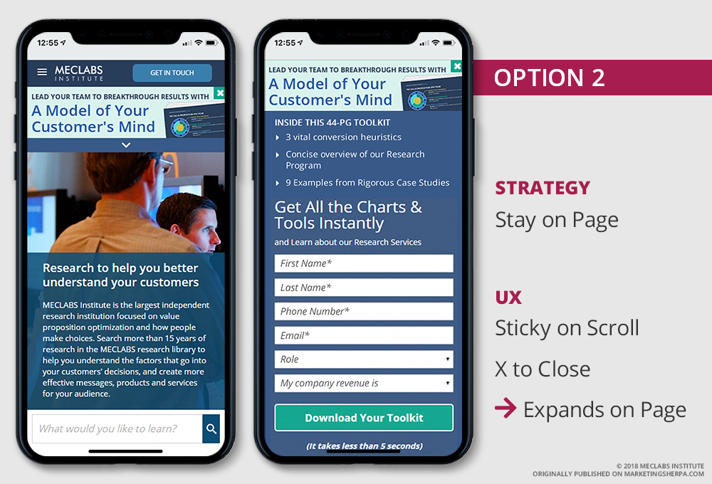
“It’s technically all on the page, but in a single accordion — not a modal overlay but still providing a single experience.”
While the design would provide two ways to close — an “x” in the upper right along with the collapse up carrot at the bottom of the screen — the fact that one of the close options was at the bottom of the screen worked against this version.
“As devices get rid of physical buttons — like the Apple iPhone X — keep in mind how things stuck to the bottom could get in the way of people swiping to go home,” Leonard said.
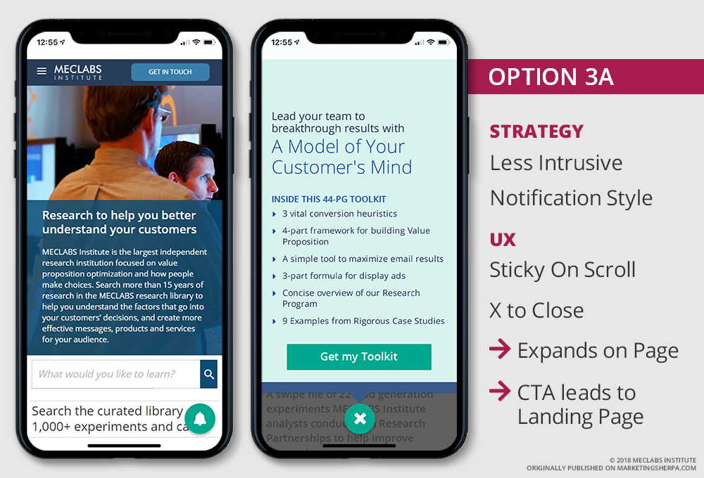
Option #3: Alert bell
Option #3A is less intrusive than a sticky banner. There would be an alert bell that would slide in and rotate like it was ringing on load to attract attention. It would be sticky to the bottom.
Once the bell is tapped, value messaging would expand up for the download. Visitors could then choose to either click the “Get my Toolkit” button and be taken to the landing page, or click “x” to close.
“The alert would be on the bottom where it’s easy to reach with one thumb,” said Chelsea Schulman, Web Designer, MECLABS Institute. “The motion would draw attention, and it’s banking on getting a click out of curiosity.”
Option #3B is similar, except once the “Get my Toolkit” button is tapped, the expanding panel messaging is replaced with a form allowing visitors to download the toolkit. They are not taken to a separate landing page.

This version assumes that most visitors do not need all the info on the landing page to decide to download the toolkit.
“This version should load faster than a landing page since it’s just a form,” Schulman said.
Option #4: Include a message with the alert bell
Option #4 is similar to Option #3, except it includes a message that would slide out of the bell to give the visitor an idea of what’s behind a click on the bell: New Research Service. The message would slide out upon visit and then slide back in after a few seconds.

“It doesn’t feel like a banner ad. There is different psychological positioning. It doesn’t feel as salesy,” Leonard said.
The version we chose
Hopefully, these options spark some ideas for your own mobile messaging. We ultimately chose the more traditional sticky banner (Option #1B) but may test an alert style in the future.
A consistent sticky banner as visitors scroll should help overcome banner blindness. To draw visitors’ attention to the message even more, we implemented motion when it loads — it slides down. That extra motion tends to draw the eye.
When implementing your own mobile calls to action, make sure you balance the user experience with the need to make sure they don’t overlook important messaging.
“There is a bigger annoyance factor on mobile, especially if they have slow data service. A clean experience is crucial, and you want them to feel confident in the click,” Leonard advised.
“Entice but don’t overwhelm,” Schulman concurred.
Related Resources
Learn how to improve conversion on your mobile devices in the free MECLABS Institute Mobile Optimization Micro Class
Mobile Email Marketing Chart: A look at the mobile and desktop email funnel for nonprofits
Google's Revised Mobile Guidelines for Modal Forms — information about Google’s deprioritization of mobile modals
Been There, Done That: Are marketers neglecting the mobile app experience?
Better mobile optimization results from deeper understanding
Join our thousands of weekly case study readers.
Enter your email below to receive MarketingSherpa news, updates, and promotions:
Note: Already a subscriber? Want to add a subscription?
Click Here to Manage Subscriptions
Get Better Business Results With a Skillfully Applied Customer-first Marketing Strategy

The customer-first approach of MarketingSherpa’s agency services can help you build the most effective strategy to serve customers and improve results, and then implement it across every customer touchpoint.
Get More Info >MECLABS AI

Get headlines, value prop, competitive analysis, and more.
Use the AI for FREE (for now) >Marketer Vs Machine

Marketer Vs Machine: We need to train the marketer to train the machine.
Watch Now >Live, Interactive Event

Join Flint McGlaughlin for Design Your Offer on May 22nd at 1 pm ET. You’ll learn proven strategies that drive real business results.
Get Your Scholarship >Free Marketing Course

Become a Marketer-Philosopher: Create and optimize high-converting webpages (with this free online marketing course)
See Course >Project and Ideas Pitch Template
A free template to help you win approval for your proposed projects and campaigns
Get the Template >Six Quick CTA checklists

These CTA checklists are specifically designed for your team — something practical to hold up against your CTAs to help the time-pressed marketer quickly consider the customer psychology of your “asks” and how you can improve them.
Get the Checklists >Infographic: How to Create a Model of Your Customer’s Mind
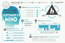
You need a repeatable methodology focused on building your organization’s customer wisdom throughout your campaigns and websites. This infographic can get you started.
Get the Infographic >Infographic: 21 Psychological Elements that Power Effective Web Design
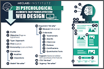
To build an effective page from scratch, you need to begin with the psychology of your customer. This infographic can get you started.
Get the Infographic >Receive the latest case studies and data on email, lead gen, and social media along with MarketingSherpa updates and promotions.
