by
Daniel Burstein, Director of Editorial Content, and
Dr. Liva LaMontagne, Editorial Research Manager
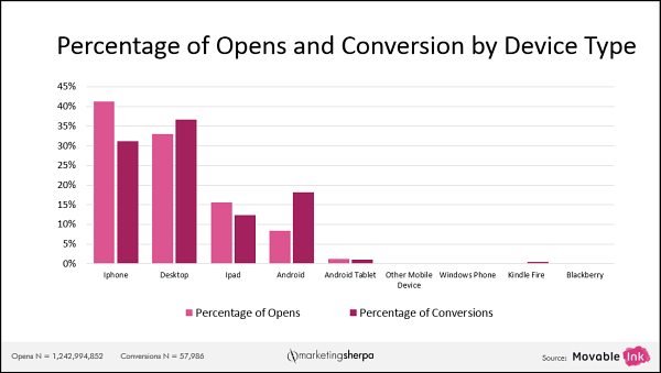
From January 2015 through March 2015, Movable Ink collected data on how customers engage with email while using their preferred devices. The below chart shows the devices customers used for opening their emails and making purchases, based on over 1.2 billion email opens and 57,000 conversions.
Click here to see a printable version of this chart
We sat down with Jessica Jacobs, Director of Product Marketing, Movable Ink, at the
MarketingSherpa Media Center at IRCE 2015 to discuss recent developments in mobile marketing and learn how marketers can prepare for the growing importance of the mobile channel. Watch the video interview with Jessica Jacobs, and read further analysis of the data in the article below.
Mobile opens have surpassed desktop opens for the first time
Every month, Movable Ink sends out four to five billion emails and measures where emails are opened and where people are converting.
The data show that mobile opens (50.12%) have surpassed desktop opens (32.97%). What’s more shocking is that, while 36.6% of people make purchases on a desktop, a whopping 49.3% of people make purchases on smartphones.
"People have been calling 'the year of the mobile' probably since 2012. We do this research every single quarter [since 2013] and this is ... the first time that we've see conversions actually climbing — you’re not just opening and looking on your phone but you're driven to action and engagement by content that you see," Jacobs said.
Rick Kenney, Director of Strategic Initiatives, Demandware, also agrees that phones are the device driving digital commerce growth.
"By the end of 2015, Demandware predicts that phones will be the number one device for digital commerce shopping, unseating computers," Kenney said.
Demandware studied the shopping activity of 200 million customers on 1,200 retail sites. Based on Demandware’s Q1 2015 Shopping Index report, 35% of all traffic is from phones, a 38% increase from last year. Phones accounted for 76% of the growth in number of visits and 48% of the increase in orders.
iPhone versus Android conversions
Interestingly, the type of phone used by customers has an effect on conversion and open rates. iPhone gets more opens than conversions but, among Android users, the situation is the opposite — they get a bigger share of conversions compared to their share of opens.
"When brands are effectively optimizing for mobile, they’re creating an email experience that ties to the on-site shopping experience. The Android conversions may be driven by the aesthetics, and how the site renders on their [screen], where there might be limitations still on iPhone, but both really have shown large conversion numbers," Jacobs explained.
Mobile marketing tactics
Now that we have an understanding of the overall data, let’s take a look at the three mobile tactics every marketer should consider.
One: Create an efficient shopping experience
Create websites optimized for mobile — make buttons bigger and easier to read. This is something brands are doing quite well already.
"As we see the conversion data climbing higher and higher on smartphones, that's pointing to the fact that brands are now creating much better mobile shopping experiences," Jacobs said. "You have to create an experience [where] it's easy to do what you want to do — to see the products, to actually fill out your credit card information."
If mobile apps are part of your strategy, make sure to target by device. "We’re seeing brands optimizing their entire mobile experience specifically for a device," Jacobs said. "Besides making buttons bigger and easier to read, they can drive someone that opens on an iPhone to go to the App Store; they can do the same for an Android ... You don’t want to send someone that's on their computer a call-to-action to download your app, so it’s really important to do device targeting there."
As for the emails you send, consider the way people read content on mobile devices. Jacobs emphasized that the time people spend reading email is short and shrinking. "iPhone users are the least captive audience,” she said. “70% of iPhone users are reading an email for less than 15 seconds. So when brands are trying to jam too much content [into their emails], or their messages and calls-to-action are mixed, they're losing that audience very quickly and then they're losing that conversion if they don't have any easy on-site experience."
Kenney echoed that sentiment. "Phones are filling the hallow minutes of today’s consumer — waiting for a train, picking up kids, etc. ... This is leading to a dramatic decrease in time spent on a site. This means the role of the marketer has changed — they must not simply drive the shopper to site, but rather inspire them to action and make the journey efficient. Marketers should consider embedding traditionally site-focused tools like guided selling and personalization directly into the marketing message," he said.
Two: Decide which (and how many) devices to optimize for
"We see that brands are starting to look at the data around their specific sector, or their specific email program and, if they see almost all of their opens are one device versus another, they’re making sure they’re putting resources [for] optimizing their website for that device," Jacobs said.
If you choose responsive design for your website, you must determine how many breakpoints of device sizes to optimize for. As devices proliferate, this has only gotten more challenging.
For example, besides desktops, tablets and phones, we are now also seeing the growth of the phablet — comprising 20 percent of all active smartphones globally, up from three percent two years ago, according to Yahoo’s Flurry Analytics. Phablets are defined as smartphones with a screen size that is between a phone and a tablet, roughly between five and 6.9 inches (like the Samsung Galaxy Note).
"I think that it’s pretty difficult for a company to decide right off the bat [what] they should be optimizing for. This is why it's helpful to look at the data," Jacobs said. "Right now most of the companies that we work with are optimizing purely for desktop and mobile, to start, and then if they see that the data is pointing them towards optimizing for tablet, then they can do that as well. But many of them are okay using a desktop version on a tablet. It renders well enough."
Three: Frame your metrics around the customer, not the device or visit
Throughout this article, there have been a lot of references to analyzing your data to ensure your site is being optimized for the experience your customers expect. Of course, to use this data, your analytics have to be set up in the right way.
Yes, you should know what devices your customers are using, and adjust accordingly. Beyond that, think about how you can move from visit-focused (e.g., conversion rate only) to shopper-focused metrics.
Collaborate with customer relationship management and sales. "With the rise in cross-device shopping, visit-focused metrics are not in step with today’s retail reality," Kenney said. Instead, retailers should frame their metrics around the shopper. "Marketing and CRM have a great opportunity to provide metric visibility to commerce teams and help frame their metrics around the shopper."
"Instead of looking at conversion as the end-all-be-all metric, retailers should track unique orders per shopper and active shoppers as two primary metrics. This calls for a collaboration between CRM and commerce teams, which is already established in many organizations. For those not yet there, this is a great opportunity to get close."
Identify a customer’s shopping activities across devices. The biggest challenge for marketers is to understand and optimize the customer’s buying journey. Kenney highlighted that cross-device shopping is rising (up 15% from last year according to Demandware’s Shopping Index report), and thus marketers need to recognize the shopper across devices and deliver appropriate messages. These include personalized product offers or abandoned cart reminders.
How can you do that?
"One method to increase recognition of cross-device shoppers is to use email marketing to intermediate their devices," Kenney said. "Email marketing typically represents about 20% of retail traffic, and often a higher share of orders — 25-30% for some."
"While phones represent about 18% of orders, over 50% of emails are opened on phones. One quick tip is to include a link to the shopping basket, both for abandoned cart campaigns and in traditional promotional campaigns. By doing so, retailers can recognize more phone users since they are very likely to open emails on their phones," he said.
Related resources
Watch all of our interviews from &THEN, DMA’s annual conference
Subscribe to MarketingSherpa Chart of the Week — Access the data and discoveries you need to better serve customers and improve results
Why Email Marketers Need to Think APIs, Not Big Data (from Movable Ink)
Demandware Shopping Index 2015 Q1 report (from Demandware)
All 43 interviews from the MarketingSherpa Media Center at IRCE 2015US Consumer Device Preference Report Q1 2015 (from Movable Ink)
Ecommerce Research Chart: How mobile can help you maximize your email marketing investmentSize Matters: Phablets Reach 20 Percent Penetration Of Smartphone Market (by Greg Sterling from Marketing Land)
Email Messaging Online Course (from MarketingSherpa’s parent organization, MECLABS Institute)


