

|
SUMMARY:
Here’s why a company website is so much harder to keep at a high-performance level than a company brochure… …for a brochure, you must make an effort to change it. However, your team is naturally making changes to your site several times a month…or week…or even every day. All these little changes can add up to death by a thousand cuts to your website strategy over time. To help you step back and re-envision the fundamental elements of your site, read on for examples from an AI tool, fragrance ecommerce site, and commercial collection agency. |

This article was published in the MarketingSherpa email newsletter.
How do you get the highest-quality conversion on your website?
“Draw a clear connection between the prospect and the webpage’s objective,” Flint McGlaughlin taught in Website Strategies: 4 ways to prepare your marketing team to increase conversion rates.
To help you make that connection, we bring you three quick case studies in today’s article with simple strategies you can easily apply to your website. These simple strategies are meant to spark your own ideas about how to best leverage the three fundamental elements you can optimize on your website – design, functionality, and copy.
First, an artificial intelligence tool uses an animated thumbnail to connect the prospect with a key objective on its landing page – watching a product explainer video. Then, an ecommerce site simplifies its nav to quickly connect prospects to its products. And finally, a B2B collection agency surveys prospects to determine what they want to know and uses those discoveries to inform homepage copy.
Do you have a strategy for your website design? Does every visual element help communicate your website’s objective to a potential customer? Here’s a quick case study to get you thinking about the design elements of your website.
“We are running ad campaigns on Google and Facebook to promote the lifetime deal of our product,” said Krittin Kalra, Founder, Writecream.
The team tests the landing page that the ads drive traffic to.
At the top of the landing page is an explainer video that describes the product in two minutes. The video had a static thumbnail.
Creative Sample #1: Static video thumbnail
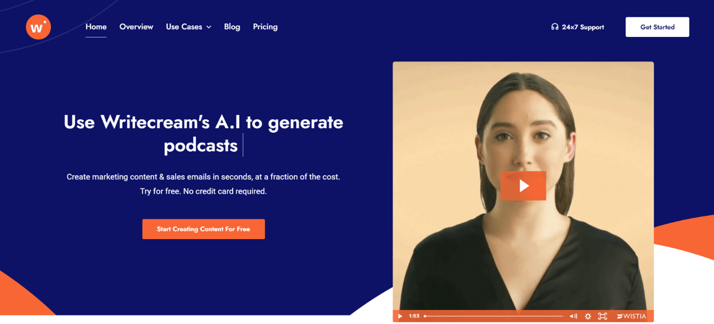
The team decided to try testing an animated thumbnail showing a snapshot of the presenter speaking.
Creative Sample #2: Animated video thumbnail

Originally, 20 percent of visitors watched the video. The change to an animated thumbnail increased its website conversion rate for video views to 60 percent of visitors.
“We are still experimenting with this page and improving it constantly. Our conversions and average session times have increased week-on-week which makes us believe that we are making the right changes. We use Hotjar and Google Analytics to track user activity. The video session recordings from Hotjar have proved very helpful for us,” Kalra said.
Do you have a strategy for your website’s functionality? Does every element help create a user experience for the visitor that furthers your website’s objective? Here’s a quick case study to get you thinking about the functional elements of your website.
FragranceX is an ecommerce website selling fragrances. “Our conversion rate was 2.79 percent – roughly average for our industry – but we wanted to see if we could improve it,” said Leanna Serras, Chief Customer Officer, FragranceX.
The team analyzed the websites of three of its closest competitors and realized that its website navigation could be more streamlined. By using web analytics tools, they confirmed that many users were having trouble navigating the site and frequently had to click through many pages to find what they wanted.
Through user testing, the team realized that its navigation menu was perceived by users to be cluttered and confusing. The issue was that the navigation offered too many options to choose from, causing users to feel overwhelmed.
The team reduced the main categories in the navigation bar from 17 to 10, focusing on the most popular categories including best sellers, new arrivals, and celebrity scents.
Creative Sample #3: New navigation

The new, simpler navigation increased the site’s conversion rate from 2.79 percent to 3.53 percent.
“We received feedback that our users preferred the new navigation, saying that it was easier to find what they were looking for in a few clicks,” Serras said.
Do you have a strategy for your website’s copy? Do all the words on your site communicate the information the visitor needs to know in order to act on your website objective? Here’s a quick case study to get you thinking about the messaging on your website.
Kaplan Collection Agency offers commercial collection agency services to help businesses recover their debts.
The company's homepage had the following copy:
The Kaplan Group is a full service business debt collection agency.
We're based in Los Angeles, serving clients nationwide. Our agency specializes in commercial collections and large claims. We resolve business debt by getting the people who control the money to pay what they owe – simple as that! We've perfected our craft over the past 25 years.We don't use auto-dialers, collection scripts and form letters. Our agency's proven collection method yields an 85% succes rate on large viable claims.
The team wanted to know what was most important to users when they first visited the site. They surveyed users and discovered that potential customers wanted to know three things: the agency’s success rate, if there was a fee if the agency failed to collect, and if quotes were free. Some users also said they wanted to know if the agency was accredited by reputable institutions.
The team redesigned the homepage according to the survey feedback. The new homepage copy read:
Commercial Collection Agency Services
The Kaplan Group Has An 85% Success Rate
There is no cost to you unless we collect
[button] Get A Free Quote
“We also featured a selection of logos of reputable institutions – such as Better Business Bureau, Forbes, Google Reviews, Trustlink and IACC (International Association of Commercial Collectors) – to show we were industry accredited,” said Dean Kaplan, CEO, Kaplan Collection Agency.
The new website strategy increased homepage conversion from 3.47 percent to 5.31 percent.
Proven Website Marketing Tactics: 1 large and 5 small changes that got big results
Landing Page Blueprint – Get this infographic PDF to help you create and optimize high-converting landing pages
Web Optimization: How one company implements an entire testing strategy every day

Join our thousands of weekly case study readers.
Enter your email below to receive MarketingSherpa news, updates, and promotions:
Note: Already a subscriber? Want to add a subscription?
Click Here to Manage Subscriptions
Get Better Business Results With a Skillfully Applied Customer-first Marketing Strategy

The customer-first approach of MarketingSherpa’s agency services can help you build the most effective strategy to serve customers and improve results, and then implement it across every customer touchpoint.
Get More Info >MECLABS AI

Get headlines, value prop, competitive analysis, and more.
Use the AI for FREE (for now) >Marketer Vs Machine

Marketer Vs Machine: We need to train the marketer to train the machine.
Watch Now >Live, Interactive Event

Join Flint McGlaughlin for Design Your Offer on May 22nd at 1 pm ET. You’ll learn proven strategies that drive real business results.
Get Your Scholarship >Free Marketing Course

Become a Marketer-Philosopher: Create and optimize high-converting webpages (with this free online marketing course)
See Course >Project and Ideas Pitch Template

A free template to help you win approval for your proposed projects and campaigns
Get the Template >Six Quick CTA checklists

These CTA checklists are specifically designed for your team — something practical to hold up against your CTAs to help the time-pressed marketer quickly consider the customer psychology of your “asks” and how you can improve them.
Get the Checklists >Infographic: How to Create a Model of Your Customer’s Mind

You need a repeatable methodology focused on building your organization’s customer wisdom throughout your campaigns and websites. This infographic can get you started.
Get the Infographic >Infographic: 21 Psychological Elements that Power Effective Web Design

To build an effective page from scratch, you need to begin with the psychology of your customer. This infographic can get you started.
Get the Infographic >Receive the latest case studies and data on email, lead gen, and social media along with MarketingSherpa updates and promotions.
