by
Courtney Eckerle, Managing Editor
"Many people know Dell and are aware of its story," Vogel said. "As a marketer, that prominence is both an asset and a challenge to constantly innovate alongside our product."
As Dell continues to consistently evolve, the marketing behind it has to as well.
Vogel said that generally, "We have made a strategic decision to focus on omni-channel and the customer journey, which has helped us align to drive efficiencies and strategic changes throughout the organization. As email continues to be a springboard to many of the big vehicles, it is something that needs to remain a priority."
CHALLENGE
In this effort, Vogel and her team saw an opportunity in what a lot marketers would consider a hassle.
"Dell transitioned [its] email service provider … As we transitioned partners and major processes, it [was] a really good time to go back and revisit some things that have been in place," she said.
The team was trying to find ways to improve across the board as they were recoding email templates "and, of course, looking for ways to optimize the template to have it get a fresh, new look and increase all of our key performance indicators, if possible," she said.
The specific goal they identified for the effort covered in this case study was to determine the impact of moving the typical email's top navigation.
It's a small change for such a large company, but the team wanted to drill down to smaller aspects to see if they could be a catalyst for bigger improvements.
According to Vogel, the team questioned, "you'll see many brands include navigation within their email template, but why? Is it really a 'best practice'?"
Previously, there was a lot of focus on ensuring a similar email-to-site experience, she added, "but our hypothesis was that moving the traditional top navigation to the email footer could lead to greater hero engagement, and ultimately increased performance."
Historically, she said, the header had received a lot of browsing clicks, and the goal was not to lose those clicks but repurpose them to drive more traffic further down the purchase path to a higher converting page.
"We have already implemented some innovations like HTML5 video, adaptive content [and] animated GIFs … but was there an opportunity to revisit the basics and redirect browsing traffic to converting traffic," she said.
CAMPAIGN
"Having worked in digital, and email specifically for years, there are so many hot topics when it comes to email. We're always looking for the next really sophisticated thing to integrate … [but] this really was back to the basics," Vogel said.
There are "bones within every email," she added, so something as simple as removing a header or making another small change to that seemingly rigid template can yield very significant results.
"The topic of the top navigation had been around for some time and we saw different industry research and case studies advocating to reallocate the placement," Vogel said.
As a result, the team decided to run an A/B split test to learn and understand what the results would look like for the Dell consumer segment.
Step #1. Find every opportunity to optimize
According to Vogel, the top navigation had been the same for "as long as I can remember."
As the team researched, they discovered that "If you look in the industry, there's different industry research and case studies. Some support the usage of the header along the top and others take it out. That was something we hadn't tried before at Dell," she said.
Click here to see the full version of this creative sample
As a result, the team decided to do an A/B split test to determine what it would look like for Dell consumer emails if the team was to take the
navigation out of the header, and either take it out completely or put it in the footer.
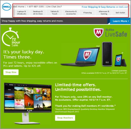
"The Control [was] your typical top navigation within the header space of the email. This included links to view laptops, desktops, electronics and accessories and more." The header matched the navigation of the Dell website.
"The test version simply took this navigational element and moved the real estate to just above the footer," she said.
She added that the team also included iconography within the footer test to give the navigation a more visual look and feel.
"As a result, we were able to reduce noise and see more hero content above the fold. Since this was a creative test in nature, we relied on our creative resources to help optimize the user experience," she said.
The team decided to use navigation as more of a recovery module, to capture traffic not interested in the main message of the email, Vogel said.
"Just to give a visual of what it would look like, it would have the hyperlink to laptop, desktop, tablet, printers, monitors, whatever those key categories were. The test version simply took out that navigational element and moved that real estate to just above the footer," she said.

Click here to see the full version of this creative sample
Instead of just hyperlinking words, the team also used more
iconography within the footer to give it a visual element.
As a result, "we were able to really reduce the noise before the recipient would see the key message … you open the email and really focus on the hero content," she said.
Since this was a creative test in nature, the team relied on the creative resources to help execute the design. There are nearly unlimited examples of Dell marketing materials to look at to determine design, Vogel said.
"When we originally built our Dell templates, our thought then was to align our email with the site experience [using the same] navigation," she said, when describing the email header.
As Dell.com has transitioned over time, the team started thinking that the consistency between the email template and Dell.com wasn't as important as the desktop email experience and the mobile email experience, and "making sure [customers] could navigate easily to their intended content," Vogel said.
Step #2. Gain buy-in for running test
According to Vogel, once the team came up with the hypothesis and plan for this test, one of the biggest hurdles was getting it approved.
"We usually get quite a bit of traffic in through that navigation panel. I'm sure this is pretty common for others as well — the top left is a key area for people to click on. By removing that navigation and going against what we had done for so long, there was definitely some risk. We wanted to keep that to a minimum," she said.
The test went smoothly once the team got the go-ahead to implement it, but getting to that point was a "joint effort" that required pulling industry best practices, and using heat maps to show where Dell statistically gets a lot of people engaged.
"We don't really want them to engage with our email to just surf Dell.com. We want them to engage with the hero message and take action against it," she said, adding that objective simply needed to be conveyed to company stakeholders.
The strategy behind this, she said, requires "very clearly defining your objectives and reasoning behind this test, more so than [if we were] just changing color."
Step #3. Focus on mobile design
An important part of this was ensuring that removing the navigation in the header was optimized for mobile.
"Ultimately, with such a high mix of mobile and desktop opens, it is important to optimize for both with all email creative," she said.
By reducing the noise on the desktop and mobile versions by removing that header altogether, the performance across the board significantly improved, Vogel explained.
Especially in mobile, she said, "people want to get to that key message quickly," so keeping the noise to a minimum will lead them to the key message.
RESULTS
"Who would have thought removing the header would have helped us to drive change across all of Dell email globally for all of our segments, for all of our customers? It was that big of a difference just by reducing the noise," Vogel said.
Email marketers are "always chasing the next cool thing," she said, but this campaign was about some of the basics that testing can go back to.
The main takeaway, she added, is to keep the message simple, and allow the main call-to-action to do the heavy lifting in driving engagement.
"It also helped us to refocus on some of the basics. Very often marketers get seduced by the innovations and stray from some of the very basic aspects of successful email campaigns. We determined that it is best to leverage navigational elements as more of a 'recovery module' that you can include within your mega-footer versus taking up key real estate in the main preview pane," she said.
Ultimately, the team at Dell was able to achieve "very significant, double-digit increases specifically incorporating this back-to-basics creative template test. I can't share the actual percentage increase, but I will say it was very significant and built the base of Dell deciding to change their email template across the globe," Vogel said.
In completing the global rollout, the team is currently ensuring that it continues to work. Vogel said they have also identified a long list of other header and footer testing opportunities within the creative testing roadmap.
"There are so many other things that we can do," she said, including, adding "space to the side of our logo … Put an animated GIF in there somewhere, really interactive ways to engage with us. Have icon-only navigation instead of hyperlinks like we used to have. Do we need text at all?"
This campaign reminded her team, that while focusing on the more sophisticated aspects of improving your email channel, "remembering some of the basics — the subject line, preheader text — that those components within the email also remain very important as well," she said.
"It completely changed and gave a facelift to our email program. It's helping our email be more effective," she concluded.
Jessica Vogel will be speaking about this email test at MarketingSherpa Summit 2016 at the Bellagio Las Vegas on February 22-24. Creative Samples
- Dell header navigation
- Dell footer navigation
Sources
Dell Epsilon Related Resources
Email Marketing: Dell lifts revenue 109% via GIF-centric campaignOld Dog, New Tricks: How Dell designed an email with old technology to launch a new productTips for Incorporating GIFs in Email [From the MarketingSherpa blog]
Email Marketing: How a creative throwback helped Dell boost revenue 109% [From the MarketingSherpa blog]
Marketing Research Chart: How do customers want to communicate?Event Marketing: 4 questions to ask before submitting a speaking application [From the MarketingSherpa blog]
Email Marketing: Ideas and inspiration from 11 years of award-winning campaigns [From the MarketingSherpa blog]


