

|
SUMMARY:
It’s all too easy to just keep going in the same direction. The route you know so well that you’ve already worn down a clear path. But what if you veer left? Or right? Might you find new customer discoveries and better marketing performance? In this article, we bring you examples of marketers who challenged their company’s status quo – marketers who smashed funnel lengths, top-level domains, use of capitalization, and more. Read on for examples from a large financial institution, software companies, debt settlement company, marketing agency, yacht charter, and rental car company. |

This article was originally published in the MarketingSherpa email newsletter.
Almost half (45%) of what the average person does every day is a habit. These aren’t active choices per se – driving to work or brushing our teeth – we are just going through the regular motions of our personal lives.
But how often do brands follow the same trajectory? How often are marketing departments simply working off of muscle memory?
Hopefully the quick case studies in this article are inspiration to challenge some of the long-held truths in your organization, learn more about your customer, and discover a new marketing performance lift.
The mortgage branch of a large financial institution engaged MECLABS Institute to optimize its mortgage application funnel.
The original funnel took customers from an email to a landing page to a solutions finder. There was a significant amount of drop-off with few customers making it to the solutions finder.
Creative Sample #1: Original funnel for financial institution

After conducting a data analysis on the funnel, the team sought to test a funnel approach that would eliminate friction and increase value for customers interested in buying or refinancing a home.
The team hypothesized that customers experienced undesired length-oriented friction during the interstitial landing page step in the funnel. In addition, the email contained difficulty-oriented friction and did not convey enough value to entice the customer to click through.
So they created a treatment that removed the landing page step from the funnel, added value copy emphasizing the benefits of the mortgage program, and changed the call-to-action to be more prominent to increase continuity. While the original email’s CTA was just an underlined link with a URL, the new CTA was a large orange button with the words “Find Your Solution.”
Creative Sample #2: Treatment funnel for financial institution

When the MECLABS team tested the new (treatment) funnel against the original (control) funnel, the treatment’s simplified funnel resulted in a 181% in clickthrough rate.
You can learn more about this experiment, and see other ecommerce experiments, in Unlock the Power of Your A/B Testing Program from MarketingExperiments (MarketingSherpa’s sister publication).
Organic social media testing can be a little less reliable than an A/B split test on a landing page or in an email. You can’t scientifically split the traffic that experiences your treatments to get a random sampling of customers. You’re not just dealing with human behavior, there is also a behind-the-scenes algorithm controlling exposure. And factors like when and from what accounts you post likely also affect performance.
However, if you can reasonably control for those factors, you may discover some ways to increase organic social media performance and get better results from essentially the same effort. This next test raised my eyebrows, so I wanted to share it with you.
“We had a strong suspicion that a link in the comments [of a LinkedIn post] has a higher reach, as the algorithm prefers posts that don’t make the user leave the platform easily (by clicking the link). What we didn’t know, however, was if a link in the comments would add friction, thus making it harder to click,” said Nicolas Lekkas, Head of Content, GrowthRocks.
The team at GrowthRocks set up two tests to see whether changing the place of a link affects the reach and/or clickthrough rate of the post – one test used two accounts with a low number of connections and the other used two accounts with a high number of connections.
The team discovered that a link in the comments section (instead of the main post) not only produced 2.9 times more post reach but was clicked 2.7 times more often.
“Since the day we got the results, we stopped inserting the link in the post and started putting it in the comment section instead,” Lekkas said.
“As a software company, the only hands-on experience our customers have before purchasing our product is through a demo that walks them through our platform,” said Anna Korolekh, Marketing Director, OroInc.
The team was getting returning traffic to their software demo page but low conversions.
Creative Sample #3: Original (control) software demo page for software company

To increase conversion, the team created a new landing page and added customer logos and testimonial quotes to build trust with returning traffic. They also changed the content above the fold to reduce anxiety and increase the perceived value of the demo (product-level value of this free “product”) with the lines “No need to contact our sales to start the demo. You are free to test and enjoy the experience all by yourself.” and “No time limits. You will access the demo instantly after you fill out the form and you will be able to access it anytime for as long as you need it.”
Creative Sample #4: New (treatment) software demo page for software company

The new version produced a 19% decrease in bounce rate and 85% boost in conversion rate. “Our simple redesign made a huge impact on overall conversion numbers!” Korolekh said.
“I think the main reason why the treatment was so successful was that we shifted the focus from talking about what we thought was so cool about our product and our product’s demo to what our customers might feel like was the most important. Meticulously going through the demo experiences of all our competitors, we saw what our potential customers can object to in those experiences and made sure we clearly stated that with our demo they will never have to endure that pain,” she said.
When you think all that can go into a marketing campaign – shooting a TV commercial, designing ads, expensive incentives, investing in tech platforms for personalization, automation, or a million other things – it can seem like magic when something as simple as changing a few words on a page can have a significant impact on conversion.
But copy testing has delivered results time and time again. Here’s an A/B test example of headline copy on a page. The goal was to improve the headline of the page to increase lead conversions.
Control: Get started today! Select your debt below
Variation A: Consolidate your debts with a single payment!
Variation B: Get debt relief without bankruptcy!
“Copy that is specific, positive, and highlights the value of our product outperformed our control by 4.3% (Variation A). Highlighting one of our customer’s pain points converted at a rate that was 4.8% worse than the control (Variation B),” said Kirill Polevoy, Director of Product, Accredited Debt Relief.
A little explanation of the value behind Variation A if you’re not familiar with this industry – before enrolling in the program clients are usually making multiple monthly payments on their debts.
“We determined that variation A outperformed both the control and variation B because it provides specificity and a positive narrative about the consumer’s future with our product. Comparatively, the control is too vague and doesn’t provide a value statement. Variation B offers specificity but focuses on bankruptcy which inspires negative feelings for the consumer,” Polevoy said.
“We were blown away with how a few simple changes to our landing page could drastically alter how our customers engage with us as a company,” says Nicholas Daniel-Richards, Co-founder, ShipHero.
The original strategy was to give customers all the information they need upfront, with complex pricing tools, mapping diagrams, explanatory graphics and more.
Creative Sample #5: Original landing page for fulfillment software company

While the team was satisfied with the amount of sign-up conversions the page generated, those signups weren’t resulting in enough companies connecting their e-commerce stores to the platform or shipping through the company – the final conversion.
“We were able to glean from this data that customers were only signing up to understand the overwhelming amount of information that we presented on our landing page!” Daniel-Richards said.
Based on this analysis of the data, the team took a funnel-based approach and limited the information at each step in the customer journey to only the information that visitors needed at each step of the conversion process: sign-up, connect a store, and ship.
They made the following changes:
“We essentially got back to the basics and asked ourselves, ‘what do our website visitors need to know?’” Daniel-Richards said.
Creative Sample #6: New landing page for fulfillment software company

The team tracked three key conversion goals through their funnel:
This approach had other benefits as well. “By simplifying the page, ShipHero reduced average page load times from five seconds to under two seconds, which improved Google search rankings and reduced bounce – especially on mobile. Conversion increased by nearly 30% on mobile site visits,” Daniel-Richards said.
“Despite fewer customers signing up, our landing page clearly better portrayed our message and led to more customers going on past sign-up to actually use our services,” he said. “Our learnings, while not groundbreaking to those who do this every day, are a reminder about how you need to keep an eye on always simplifying messaging, while staying focused on the customer motivators.”
The domain for Charterayacht Halkidiki Sailboat Day Trips used to be charterayacht.gr.
About 75% of the traffic visiting that URL was from Greece in Greek. “It had to do with the local .gr top level domain (TLD),” said owner Christoforos Karydis.
So he moved the site, using industry best practices for moving to a new domain, to yachts.holiday – a generic TLD. Within three months, without making any significant changes to the content, the traffic level remained about the same but now Greek was only about 20% of it and 80% was in other languages. “We are talking about effects on organic traffic, but even Google Ads cost has been lower since I get better landing page rankings in other countries,” Karydis said.
“Of course as we mainly sail day trips for tourists the result in bookings growth was fantastic,” he said. “I would suggest for everyone that has a target group outside of his area/country to move his domain to a new generic TLD. There is a special tool in the old Google search console to let Google know that you are moving. You also need to redirect every old URL to the new one.”
“To promote our business, we use Google Ads mostly. We wanted to test if capitalizing the first letter of every word in our ads (headlines+descriptions) will increase clickthrough rate (CTR) by making ads stand out more,” said Ratko Vorkapić, Digital Marketing Specialist, ORYX Rent a Car.
The team created a campaign for long-term car rental that included four ad groups, each with three sets of ads, each set containing two ads with the same titles and descriptions with the only difference being the capitalization – all words capped versus only the first word capped (also known as sentence case). The A/B testing lasted three months.
Creative sample #7: Ads with all words capitalized versus sentence case for car rental company
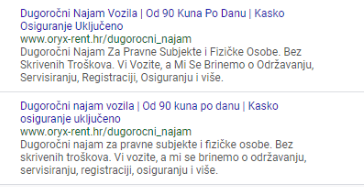
In 9 of the 12 ad sets the ads with only the first word in headlines and descriptions capitalized had a higher CTR than the ads with ever word capitalized. The increase ranged from a 6% higher CTR to 64% higher.
Related Resources
A Behind-the-Scenes Look at Creating an A/B test
Ecommerce: 10 mini case studies of successful marketing for online shopping
Digital Marketing: Six specific examples of incentives that worked

Join our thousands of weekly case study readers.
Enter your email below to receive MarketingSherpa news, updates, and promotions:
Note: Already a subscriber? Want to add a subscription?
Click Here to Manage Subscriptions
Get Better Business Results With a Skillfully Applied Customer-first Marketing Strategy

The customer-first approach of MarketingSherpa’s agency services can help you build the most effective strategy to serve customers and improve results, and then implement it across every customer touchpoint.
Get More Info >MECLABS AI

Get headlines, value prop, competitive analysis, and more.
Use the AI for FREE (for now) >Marketer Vs Machine

Marketer Vs Machine: We need to train the marketer to train the machine.
Watch Now >Live, Interactive Event

Join Flint McGlaughlin for Design Your Offer on May 22nd at 1 pm ET. You’ll learn proven strategies that drive real business results.
Get Your Scholarship >Free Marketing Course

Become a Marketer-Philosopher: Create and optimize high-converting webpages (with this free online marketing course)
See Course >Project and Ideas Pitch Template

A free template to help you win approval for your proposed projects and campaigns
Get the Template >Six Quick CTA checklists

These CTA checklists are specifically designed for your team — something practical to hold up against your CTAs to help the time-pressed marketer quickly consider the customer psychology of your “asks” and how you can improve them.
Get the Checklists >Infographic: How to Create a Model of Your Customer’s Mind

You need a repeatable methodology focused on building your organization’s customer wisdom throughout your campaigns and websites. This infographic can get you started.
Get the Infographic >Infographic: 21 Psychological Elements that Power Effective Web Design

To build an effective page from scratch, you need to begin with the psychology of your customer. This infographic can get you started.
Get the Infographic >Receive the latest case studies and data on email, lead gen, and social media along with MarketingSherpa updates and promotions.
