by
Kayla Cobb, Reporter
THE CUSTOMER
BusinesSuites, a provider of serviced and virtual offices, works with clients across the United States. The company prides itself as being the business home for thousands of professionals, entrepreneurs and employees of large companies and provides premium executive suites, virtual office services and meeting rooms for companies of all sizes.
"We have about 30 locations, and it's definitely a location-based business," Dana Kraft, Director of Marketing, BusinesSuites, said. "Our goal, really, is to fill up all those locations."
BusinesSuites often takes a floor of an office building and breaks it into individual office spaces. Its service incorporates several essential elements of office life, including Internet, phone services, receptionist services, shared meeting rooms and a kitchen area.
"It is a much more flexible and people-service approach than a conventional office space would be," he said.
CHALLENGE
While BusinesSuites was gaining leads from its site, the company wasn't seeing the level of conversion it expected. This was especially troublesome because most of the company's traffic comes from its site.
"The challenge, or what we were trying to accomplish with this was to find a way to dramatically change the conversion rates we were seeing on the different kinds of pages on our site," Kraft said. "We wanted to try to find a way to dramatically kind of break out of the — for lack of a better word — the band that we have been operating in from a conversion rate perspective."
CAMPAIGN
Changing conversion rates required a different approach to managing the BusinesSuites site. Initially, the company's website experienced small, incremental changes instead of experiencing large releases every year or every 18 months.
Kraft explained the company's previous approach, saying, "We can nibble around the edges, and we've made an incremental improvement for various reasons. Some cases there [are] SEO reasons, and some cases, there [are] conversion rate reasons, so that's always a balance."
However, when these incremental website changes were not providing the conversion rates BusinesSuites wanted, Kraft and his team looked into taking a more drastic approach. The team decided to dramatically change the site's landing pages and form fills, even going against what the company believed were best practices.
By drastically changing the landing pages and form fills, the team at BusinesSuites saw conversion rates 88% higher than they had seen on previous pages. Learn how, by launching a large test and being willing to change perceived best practices, BusinesSuites was able to transform its site's conversion rates.
Step #1. Decide which site elements to optimize
The team had to first decide what site elements they wanted to test. BusinesSuites currently offers three different service options and serves several different geographical locations. In fact, highlighting the company's ability to cater to so many different geographical markets coupled with its access to high-end addresses is part of its marketing strategy.
"We have some different product lines. Obviously, we are in different geographies, but given that we wanted to make a huge change [with this test], we really decided that we needed to step out, to find a way to step out of the current design and look and feel of our website," Kraft said.
The team didn't see the site's design and aesthetic as limiting, but Kraft acknowledged that, when working with a corporate site, some limits are imposed for worse, instead of the betterment of the site.
"We wanted to be able to step out of those limits and do something completely different," he said.
The team decided to make design and copy adjustments to the landing pages and form fill process while staying within brand guidelines. Because the team was familiar with running A/B split tests on the site's incremental changes, they decided to measure the effectiveness of these redesigns by utilizing an A/B split test.
Step #2. Determine the test’s control
Now that the team had decided to test BusinesSuites' landing pages and form fills, they needed to decide what to test these redesigned site elements against. They decided the easiest way was to split the site's paid traffic 50/50. According to Kraft, there were a few reasons why the team decided to test exclusively with paid search.
The consumers directed through paid search represent a large, consistent and predictable set of visitors for BusinesSuites, making this segment a great testing target. Utilizing paid traffic also gave the team more control over visitors' experiences as well as control over the path outside of the brand's existing site layout and design.
Click here to see the full version of this creative sample
They decided to make paid search the treatment because, "we kind of control how they find us, how many of them there are, where they are coming from," Kraft said. As a result, the team could somewhat control how many people saw the treatment landing pages.
As for why the team specifically chose
the landing pages to test, he said that SEO played a factor.
"Obviously SEO isn't a concern [on the landing pages], so we just have a little bit more freedom to operate in that segment than we did if we just tried various pages on the site," he said.
Step #3. Create treatment pages
After it was determined what the test would consist of, the team had to then decide what the treatment pages were going to look like, as well as what metrics they were going to measure. For this part of the campaign, they enlisted the help of a third-party vendor who already managed BusinesSuites' page search counts.
Because these page search counts were already being monitored, the team was able to use this information to determine what the best page changes may be.
Landing page treatments
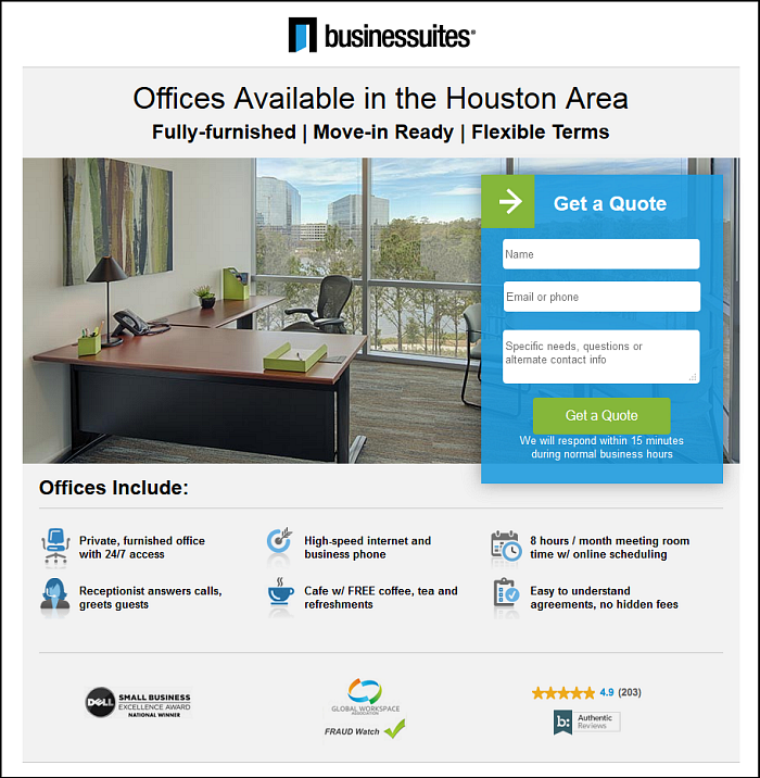
"What we decided to do, specifically, was really limit the copy and direct everything to the form fill on the page," Kraft said.
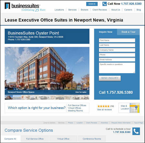
Kraft and his team took this redesign opportunity to really scale back the landing page itself. Before the redesign, there were large blocks of text explaining BusinesSuites' offered services as well as lists of addresses and maps.
This changed for
the treatment. The copy was condensed into a few bullet points, which explained BusinesSuites as a service. There were also third-party logos of awards the company had received and a list of groups associated with BusinesSuites.

Click here to see the full version of this creative sample
"The things that we ended up having on the page were literally just the headline," Kraft said. "It said, 'We have offices available in … ' and then whatever the market was. It had a single image of an office. It had a shortened form and obviously a call-to-action on that form, to get a quote."
"We didn't really have any detailed descriptions of our services, or our company, maps," he added. "There was one photo in there and that was it. We didn't even have a phone number on the page."
Form fill treatment
The landing page treatment mostly focused on directing customers to the form fill, but the form itself also received an update. The new form was shorter to complete, but, as a whole, its message stayed the same. The test's hypothesis questioned whether fewer fields would appear less daunting to customers and, if that was the case, if this change would increase conversion.
"It was the same call-to-action — generally to say we have offices. Just fill out this form and get some information or get a quote," Kraft said.
The control version included six form fills, but the treatment decreased these fills to three. This was accomplished by:
- Combining the "First Name" and "Last Name" fields into a single "Name" field
- Removing the "Company" field, which was shown through analysis to not correlate with lead quality
- Combining the "Phone" and "Email" field into a single "Phone or Email" field
- Changing the "Specific Needs or Questions" field to include the phrase "or Alternate Contact Info"
Step #4. Experiment with 'best practices'
One of the biggest changes made on the landing pages was removing
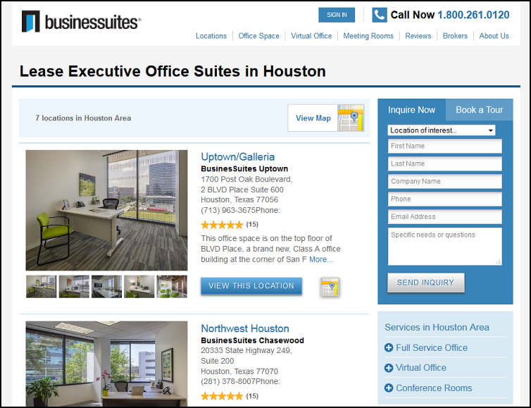
copy about location-specific addresses. In the control, once the site read that a visitor was accessing the landing page from a specific location, listings would appear on the page.
Click here to see the full version of this creative sample
Because BusinesSuites is such a location-based company that derives a lot of value from offering clients high-profile addresses, the choice to test the removal of this element was a big one. Though this decision was a difficult one to make, Kraft and his team believed that the best way to increase conversion was to drastically change the page's elements.
"One of the things that we took out of our first test and wasn't on the page was the physical location that we have centers," Kraft said. "That is so kind of antithetical to our mindset."
For example, before the landing page optimization, the site would emphasize an address not just in Los Angeles or New York, but on Rodeo Drive or Broadway.
"Everything we do is through a specific location. Realistically, we have clients that come to us specifically because of some of the addresses that we have, that are on a street that is well known," he said.
Nonetheless, the team at BusinesSuites was curious about how listing these locations potentially influenced its customers, so it
removed specific addresses.
Click here to see the full version of this creative sample
"A lot of our website has things that you would expect from a business that is delivered through locations," he said. "We have photos of the location. We obviously have the address and phone number of every location. We have pretty detailed descriptions of our services, phone numbers, maps, all that good stuff. We really wanted to test dramatically changing that, so we limited the copy."
Not having it on the page wasn’t a big deal, Kraft admitted.
"My hand was shaking a little bit when I said 'OK, we won't have the address,' but that's just an example of one of the things that we changed that was a big deal for us," he said.
RESULTS
After the test ran, BusinesSuites learned its drastic design changes had paid off. The new landing pages and form fills produced an 88% higher conversion than previous pages.
"It's a pretty significant change from what we had been doing before, but that's what we wanted," Kraft said. "If all we did was test [a] few wordy changes or [a] small change on the actual button or something like that, that wouldn't have accomplished what we wanted to do."
On other tests BusinesSuites had run, the team saw a 20-30% improvement after running an A/B split test, Kraft said. The huge conversion change BusinesSuites' new landing pages and form fills brought made the decision of whether or not to continue the experiment easy.
"We actually pushed it out to all of our paid search and it continued," he said.
The team also saw the average CPA (cost per action) of the new page decrease by 45%. However, the most interesting insight the BusinesSuites team discovered from this testing effort had to do with removing specific addresses from its site. When BusinesSuites asked its customers about the importance of different company elements, location was always one of the top two or three decision criteria.
Though having specific addresses for reference was important to site visitors, the team learned this information wasn’t as valuable to visitors at the top of the funnel. Instead, top-of-funnel visitors reacted better to knowing whether or not BusinesSuites served broad geographic locations.
"It's not that it's not important," Kraft said. "It's just not important at that point in the selling process, so that was a big lesson learned for us."
From this test, BusinesSuites noticed that customers who landed on the treatment pages acted differently than its typical prospect. The company had to create a new sales strategy to address these customers’ concerns.
According to Kraft, "We were getting a ton more forms filled or conversions, and, as we tracked that segment of leads through our pipeline, they were behaving in a different way than that segment performed before."
Kraft accredited these differently-behaving customers to the amount of information they were receiving.
"If you think about it, they had a lot less information about our company and about our services than previous leads that had come through, that were ... effectively the same segment of traffic," he said. "It's made us think about how that moment of conversion and what the website visitor's expectations are when they convert and what they expect from us."
When asked what he and his team have learned from this campaign, Kraft emphasized the importance of making tests count.
"Test something really big because, for us, we don't get millions of visitors a day, so we don't get that many opportunities in reality to test stuff in any given year," he said. "Test something big so that if it works, it can make a huge difference, and it's worth the time and investment you make in testing and then in rolling out the changes."
Creative Samples
- Landing page control
- Landing page treatment
- Location-specific addresses control
- Location-specific addresses treatment
Sources
BusinesSuites3Q Digital — BusinesSuites’ agency
Related Resources
MarketingSherpa Summit 2016 — At the Bellagio in Las Vegas, February 22-24
Landing Page Optimization Online Certification Course (From MarketingSherpa's parent research organization, MECLABS Institute)
Landing Page Optimization: How to start optimization testing and get executive supportLanding Page Optimization: Simple, value-infused page increases leads 8% in 24-hour test


