by
Courtney Eckerle, Senior Manager of Editorial Content
THE CUSTOMER
A unique freemium app (a free model that encourages customers to upgrade to a premium offer), OnSwitch sells lighting scenes to people who have colored light bulbs.
"Our customers are people who have Philips Hue hardware or LIFX hardware. They're colored light bulbs that you can buy at the Apple Store, Best Buy, wherever they sell advanced electronics. And they're color capable. That opens a whole range of possibilities. Most of the apps that are out there, they just allow you to control the color and that's it," said David Pewzner, Owner, OnSwitch.
OnSwitch, however, has designer scenes that customers can turn on with color animation running through the lights, he added.
"Some of them have sound for mood setting. So for example, we have scenes like a candlelight setting that makes your lights flicker, lightning scenes in which you have the sound of rain and you get flashes. We have several nature themes like a forest, where the lights are several shades of green that's animated, a rainbow with the seven colors flowing through your lights," he said.
CHALLENGE
In the freemium app model, some of these lighting scenes are free and some are paid.
"One challenge for us is transforming free users who can use a large portion of the app for free into paid users, meaning making them buy something. But our audience is pretty small. It's a niche of people who have these light bulbs," Pewzner said.
The first step, he added, is getting people to download the app. Mostly, that has happened organically, as people who search for apps after buying these light bulbs would see OnSwitch appear within the first few app store results.
"What's more interesting to me right now in the marketing effort is the internal marketing, which is marketing to our existing users. How do we get people who use the app for free to buy stuff or buy more stuff?"
CAMPAIGN
In this campaign, Pewzner embarked on A/B testing that mainly affected the premium or paid portions of OnSwitch. This includes push notifications, paid content packages and copy changes.
Step #1. Encourage users to engage frequently
Pewzner evaluated what was currently set up in the app, "and asked myself what would be a good way to sell more. For that, I came up with some theories," he said.
The very first theory, he said, was to get users to engage with the app more often: "They have more incentive to buy because they're more interested, they're more exposed to it."
He ran an experiment blocking some of the free content for three days, and over the course of the next three days, he would unlock it and send a push notification informing users of the available content.
"You would sign up for the app. You download it the first day. These three interesting and popular scenes would be blocked until you come back tomorrow. … The day after, you get a push notification. That seemed like a good idea. I've seen that working in freemium games to make people come back," he said.
The results surprised Pewzner, he said, finding that "people were a bit more likely to come back, but they were actually purchasing less, which is not the behavior I [expected]."
He switched gears and began wondering if he locked a different piece of content, would the results be more positive.
"I thought, 'Maybe if I lock a different piece of content, it will work better,'" he said, but the results were similar to the first test, confirming the results of the first test.
Step #2. Use customer feedback to fuel tests
Something Pewzner heard from his customers was that they wanted more substantial bundles. OnSwitch already offered six different lighting scenes in a $5 package, but users had inquired about a bigger package. He debuted one that would cost $10.
"That was a longer running experiment because obviously when you release a new product or something like that, there's a spike of purchases," he said.
The app is set up with a list of packs, which Pewzner describes as almost "like albums," and he set this offer up so some people would see it in the list of packs.
The tested layout (over the usual layout) caught user's attention with a "Sale" headline on the top of a pack list. The first few days, revenue increased, he said, but "after a while, comparing the two groups, people who have access to the bundle were paying less. So it was making less money. So another failed experiment."
That result seemed so counterintuitive, he said, "that I thought there has to be something I can change about it."
Pewzner stopped that experiment. Then, he reran it with the same price and the same package — which is what customers had requested — but put the offer in a different place within the same list. The graphic now said, "Bundle Sale," instead of just saying, "Sale."
From there, he redesigned the upsell screen to explain what the user was about to purchase. These changes "went from making me lose money to making me win money. So that's how I figured out not just what to do but also how to do it, what kind of presentation works, what appeals to users. That was really useful," he said.
Step #3. Test visual elements to catch user's attention
Pewzner has also run experiments with the text in his ratings pop-up, beginning with the initial pop-up on a user's third day of using the app, which asks them to rate the app in the Apple App Store.
"I experimented with the text to see what would lead more people to go give us a good rating. That was useful to be able to play with the text and see what impact it has," he said.
He began optimizing to find a message that was most effective for the most people, in order to get increased (and hopefully better) ratings without being as intrusive.
"At a conference, somebody was saying how if you use emoji in those pop-ups, you get a better response. So I gave that a try. It worked for me," he said.
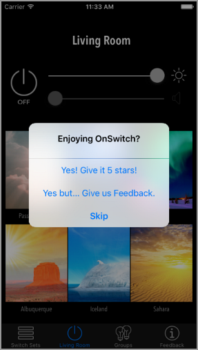
The original title of the pop-up was, "Enjoying OnSwitch?"
Click to see a larger, printable version of the chart
The original feedback options were, "Yes! Give it 5 stars," "Yes but … Give us Feedback," for the user to send feedback, or skip altogether.
Pewzner tested emojis by inserting hearts, he said, and currently, it reads, "[heart emoji] or [broken heart emoji] OnSwitch?"

Click to see a larger, printable version of the chart
Now, "Heart!" gives the app a five-star rating, "Heartbreak" allows users to send feedback and the "Skip" option is a smiley face with a straight line for a mouth.
Using the emojis decreased the use of the "Skip" button by 2.23% from the control, and drove up use of the "Rate" or five-star button by 14.65%.
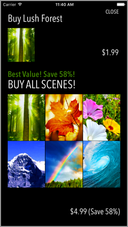
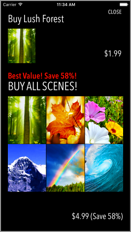
Another visual element tested and found "the most mind blowing" was text in the purchase process for lighting packages in the upsell stream to free users. The goal of this is to have users buy the entire set.
"If you tap one of [the packs], you have the option to buy one for $2 or all six for $5. There's this text that says, 'Best Value, pay $5 to get them all,'" he said.
Click to see a larger, printable version of the chart
The best value text was in green, and he A/B tested it against the color red. Simply by doing that test, he said, sales improved 5.6%.
Click to see a larger, printable version of the chart
"I thought if just changing this color was an almost 6% increase, maybe I could do more," he said.
At that point, he said, with the discovery about how large of an impact simply changing the color to red made, he began changing the buy button and the buy text, but "that actually made sales go down."
The original screen had a text in white, and the button was not very obvious at the bottom of the screen.

Click to see a larger, printable version of the chart
His changes for the treatment were to change the "Buy all scenes!" text to an eye-catching yellow, and reiterate the "Save 58%" incentive. He also made the button at the bottom look more like a button, by encasing it in red.

Click to see a larger, printable version of the chart
In spite of his success with the similar test, conversion actually went down 10% with these changes.
"My learning from this is that small differences can have a big impact and that even though you may have a good instinct for them, you don't know for sure which way things are going to go," he said.
RESULTS
When it comes to A/B testing, Pewzner said that the important part is following up on test results, even positive ones like his 5% lift with the offer color change to red.
"If it doesn't work, then the question is that I need to follow up with it. Did it not work because it's just a bad idea or did it not work because it was presented wrong? So I'll try tweaking the presentation and see how that impacts it," he said.
When you are selling to so many people and users, it's important to know what they respond to, not just guess, he added.
"I have my own tests and what would work for me, but I'm not building an app for me. I'm building an app for these people. They're all different. It's hard to predict what will work, whether it's a whole new product or just the way one thing looks," he said.
Creative Samples
- Review control
- Review treatment
- Text color control
- Text color treatment
- Text and button control
- Text and button treatment
Sources
OnSwitchApptimize — OnSwitch's vendor
Related Resources
Social Media Marketing: Over 120% increase in daily activity for app due to visual social media campaignEmail Marketing: Education group utilizes A/B testing to increase open rates by 39%Mobile Email Marketing: 50% more app downloads from device-targeted ads


