by
Erin Hogg, Reporter
Raven + Lily, an online women's boutique store selling clothing and accessories, began in 2007 as a nonprofit to raise awareness and funding for at-risk and marginalized women around the world.
In 2011, the company established relationships with women in India and Africa and aided artisans in selling their products to a larger audience online.
CEO and Founder Kirsten Dickerson noticed a trend of women being trained in design skills by other nonprofits but lacking design feedback that would help make their handmade products more appealing and marketable.
These women also did not have a way of selling their products outside of their small communities.
CHALLENGE
Raven + Lily's business model needed to change to aid women who are producing products and provide them with jobs and a sustainable way to sell their products to the world at large.
That same year, the company became for-profit and launched an ecommerce site to showcase handmade products from around the world and share the makers' stories as well as support their craft.
Currently, Raven + Lily has grown to employ women artisans in India, Ethiopia, Kenya, Cambodia, Pakistan and the U.S.
At the time of the launch, Raven + Lily's website was simply a landing page with information about the nonprofit with no shopping elements.
"We felt like we wanted to make our products more accessible to even more people, and so that was definitely a team effort to get that up and going," Crake said.
CAMPAIGN
Since its initial launch, the team at Raven + Lily revamped the site in February 2014 to further improve the shopping experience.
The team worked with a vendor to choose a new template for the site to freshen up the look.
"As a brand that works with handmade products, we still want people to feel like it's a luxury, nice item," Crake said. "Sometimes, fair trade gets a reputation for being a little bit crafty, and that's something that we didn't want associated with our brand."
From there, the team examined various areas of the ecommerce site and evaluated opportunities for improvement.
It had been three years since the initial launch, and they needed a strategy to not just improve the site, but also to optimize it in order to provide a better experience for customers.
THE CUSTOMER
Raven + Lily caters to women's products, including clothing and accessories, as well as home goods.
Customers of Raven + Lily are more socially conscious shoppers with an eye for design and who are interested in putting their purchasing power toward fair trade practices.
Through the support of customers who believe in making a decision to purchase fair trade, Raven + Lily is able to provide a fair trade wage for its artisans.
Allowing customers to shop with ease on the site not only meant success for the company, but also better lives for women around the world.
Step #1. Analyze site elements through the eyes of the customer
Once the team launched the revamped ecommerce site with the new template, they started looking at the website as a customer for the first time, as opposed looking at the site as Raven + Lily staff members who were already familiar with the inventory.
"I think it just took us sitting down and talking though, 'OK, if I'm a customer and I’m wanting to buy this product, what do I want to know about it?'" Crake explained.
To help their customers see the value in the products offered, the team saw an opportunity to update product descriptions.
Through this effort, they made sizing charts available to help customers choose the correct size of a garment, reducing the anxiety customer's may have with returning a product due to wrong fit.
Product descriptions were also changed to list out more details of the product, such as where the product was made, the recommended care instructions and tips on how to pair the piece with other accessories.
They also made the product images larger and more visible on the category pages so visitors could quickly see a wide array of offerings.
Step #2. Incorporate stories of women
The core element of Raven + Lily is its focus on the women who are producing the products.
"We always want to make sure people know where their products are coming from and can even associate a face and a name with some of the products that they're buying," Crake said.
The company works with more than 1,000 women worldwide, so they can't share every single story.
However, members of the team have visited the women, taken pictures and conducted interviews so that most of their stories can appear in association with the product.
In the product descriptions, along with the details about the specific item, the team works to ensure a piece of that story is shared on each page.
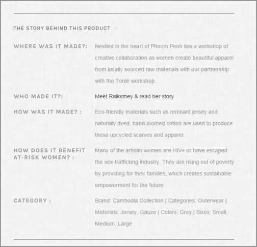
Product pages
include sections displaying where a specific piece was made and by whom, telling the story of the homes and villages of the artisans.
Click here to see the full version of this creative sample
Visitors to the site can also access more information about how a product was made by viewing the Raven + Lily blog to learn about the artisans and the mission of the brand.
Not wanting to overload customers with information, Crake and the team are careful to balance the women's stories in a way that will not take away from the overall buying experience.
They want the products to speak for themselves, instead of relying solely on philanthropic pursuits to persuade customers to make a purchase.
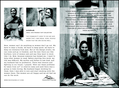
As another way to drive awareness for the artisans producing Raven + Lily products, after an item is purchased,
a card is included in each shipment, sharing a picture of the artisans as well as their stories.
Click here to see the full version of this creative sample
"That's something that we've gotten feedback that people really love so that not only can they read it online, but if they're giving it as a gift, or whenever they get it in the mail, they have a postcard that has the woman's name and information who actually helped make their product," Crake explained.
Step #3. Improve the checkout process
During the revamp of the site, look and feel were not the only elements evaluated; the team also aimed to improve the checkout process to provide a smoother purchasing experience.
Starting from the cart, the team added the product images of items in the cart to help shoppers see exactly what they are purchasing to ensure they have the right items in their cart.
In the checkout, Crake identified friction within the process and sought to provide a more seamless experience.
"We were just noticing that people were having to go through too many pages and click too many things. Once they decided they wanted to make a purchase, we wanted to make it as easy as possible," Crake said.
As a result, the team reduced the number of pages into one accordion-style checkout page with sections that expand and collapse as a user is going through the process.
They also added more clarity to the process. For example, the process includes displaying which credit cards are accepted to reduce the number of people who may become frustrated and leave the cart when a credit card they use is not accepted.
To further appeal to their customers, the team included the option to use PayPal to make purchases with Raven + Lily — something they noticed their customers using more and more.
Step #4. Upgrade search functionality
Before the revamping of the site, Crake explained the search capabilities on Raven + Lily were pretty limited.
Unless a user typed in the exact name of a product, it was difficult to find what they were looking for.
The team optimized the search bar by implementing a search app within the site template to ensure users could search products with ease.
The returned results are based more on categories rather than a single product, allowing users to see a full range of what they are searching for.
"For example, you can search by products that are made in Ethiopia, and you can actually narrow it down to products made in Ethiopia that are gold and under $100," Crake said. "It does a lot more sculpturing, and I think that'll be something that as we're working with women in all different countries and our product lines grow, that if you're looking for something really specific, it helps make it easier to find."
RESULTS
"I think the biggest lesson we learned is to think like your customer. Thinking about if this is someone's first time on our website, what do we want them to see?" Crake said.
Since implementing the revamped ecommerce site, Raven + Lily has experienced:
- Sales year-over-year increasing fourfold
- Online sales from 2012 to 2014 have increased 150%
The team attributes this success from having an improved user experience through thinking like their customers and bringing a storytelling element to their products.
"We are working with so many women around the world that have such incredible stories. Some of them come from really difficult backgrounds, some of them come from extreme poverty and sex trafficking and are living with HIV," Crake explained.
Crake emphasized how the team wants to make customers aware that they are purchasing an ethically made product that improves lives of women around the world, rather than using a more negative focus on the artisans.
"For us, the focus has always been really positive and wanting to focus on how we’re providing jobs for them, how they have hope, how they're making a difference in their communities because, for us, we never want to market in a way that creates a pity buy," She added.
In the future, Raven + Lily is continuing to discover how to make improvements and be conscious of the customer and to find new ways to share information.
On the site, the team has implemented a new coupon bar on the right side of the site to offer a newsletter sign up for new customers in exchange for a coupon for their first purchase in the store.
Crake and the team aim to "be aware of what different features that we can add that aren't just on the standard ecommerce platform, but actually things we can integrate to really improve our site."
Crake explained with the site redesign providing a solid foundation and structure, the team is
now looking for new integrations and more ways to interact with customers.
In April of 2014, Raven + Lily launched its first brick-and-mortar location, which has unexpectedly provided the team with customer feedback on their products.
"It definitely has been a pleasant surprise. I feel like the more interaction with customers, the better you can do at marketing to them. I hope that that we'll only improve as we get to know our customers locally in Austin better and be able to improve the experience for everyone who visits our website," Crake concluded.
Creative Samples
- Product stories
- Product cards
Sources
Raven + LilyBigcommerceRelated Resources
Ecommerce: 10 case studies to help you excel in content marketing, social media and website optimizationEcommerce: Moving beyond shopping cart abandonment nets 65% more checkout conversionsEcommerce: Edible Arrangements' countdown ad lifts same-day orders 8%Ecommerce: How Wine Enthusiast increased organic traffic 154% with content marketing


