December 03, 2008
How To
SUMMARY:
Optimizing emails for mobile devices doesn’t have to take a lot of time and cost that much. The ROI could fit right into leaner economic times.
Check out how a mobile-specific link in one brand’s newsletters has more than tripled traffic. Includes 5 how-to tactics and creative samples.
|
|
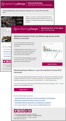
MarketingSherpa's Email Marketing Benchmark Guide 2009 says that the number of consumers who regularly check email on their mobile devices has doubled over the last two years – from 7% to 14%. The emerging smartphones should drive that percentage much higher.
Still, the Sherpa guide says that 73% of marketers do not optimize their emails for mobile users. While testing mobile optimization may be an expense your financial officer doesn't want to sign off on right now, the good news is that it doesn't have to account for a big slice of the budget.
“Building our mobile site was relatively easy and inexpensive,” says Pete Sheinbaum, CEO, DailyCandy. “We did benefit from having a talented technology team, and our content is well-suited to be viewed on a mobile device.”
The outcome of incorporating a mobile landing page for their emails? Over the first 10 months this year, their emails tripled the total number of visits to their mobile site. During the same time period, monthly *repeat* visitors jumped 18.7% and monthly *unique* visitors vaulted almost 167%.
Indeed, their text-only newsletter signups had been in steady decline. They decided that their mobile demo wanted more than text only -- they wanted an option they could read on their BlackBerrys and iPhones. The three tactics they used to accommodate mobile readers:
Tactic #1. Showcase the core message
First, they created a mobile page for email that offered much of the same core content available to a desktop or laptop user. But the design fit a mobile device.
Their emails for computer viewers are three columns from left to right. The main copy appears in the center; another news item goes on the left; a paid advertisement goes on the right.
To make the email conform to a fluid mobile template (more on that below), they cut out the two sidebars and simply delivered the main copy – normally four to five paragraphs. The chief image for the campaign also appears at the top of the mobile page.
Tactic #2. Use fluid mobile WAP
Sheinbaum says his IT team developed an in-house wireless application protocol (WAP) that allows the mobile versions of the emails to render *sufficiently* to the screen dimensions of the major hand-held devices on the market. After their emails were crafted and entered into the in-house program, they automatically conformed to a mobile device.
“Our mobile site is only a stripped-down version of a regular Web page. Technically, it’s really just in the language of [the Worldwide Web]. The dimensions are set to render on multiple phones and platforms.”
Tactic #3. Push the mobile link
The next point may appear obvious but it bears mentioning: Sheinbaum places the mobile link at the *very top* of each DailyCandy message. And, it appears in a solo fashion – it does not compete visually with a link that says: "Having Trouble Viewing? Click on Our Web Version."
They use the following lead-in copy for the mobile link: "Having trouble reading this email? View our mobile-friendly version." The mobile page also renders to the dimensions of a regular computer screen for readers who have images turned off with their email clients and happen to click the link.
Synching up the link to a mobile site also caused no headaches for his IT staff, Sheinbaum says. “It’s just a link that goes to a different Web page. Partly, because we were a database-driven site to begin with, from soup to nuts, it only took us about two weeks to get it all together.”
Two Tips for ‘Mobilizing’ Emails
Sheinbaum offers two other tips for marketers looking to ‘mobilize’ their email campaigns:
Tip #1. Think about ‘the why’
Look at the usefulness your emails will provide for subscribers when deciding whether a mobile landing is right for you, Sheinbaum says. Then your IT team or email services provider can build the interface and supporting applications according to their needs.
“And you shouldn’t just take your email template or website and simply shrink it down for a hand-held device. You got to build the experience around the reason why people would want to look at your offer while walking on the street or riding in a cab.”
Tip #2. Don’t rush it
Don't hurry a mobile link into a campaign. Getting ahead of the curve with hand-held email readers is big, Sheinbaum says, but it's more important to get it right.
“People have to get out ahead of it, but they have to do it [intelligently]. And don’t just do it for the fact that everyone else is. Once again, know why you are doing it.”
Useful links related to this article
Daily Candy’s Creative Samples: Convert Hand-held Subscribers into Brand Addicts:
http://www.marketingsherpa.com/cs/dailycandy/study.html
Email Marketing to BlackBerrys - Usage, Formatting & Rendering Tips
https://www.marketingsherpa.com/barrier.html?ident=30057
Special Report: iPhones & Email Marketing - 10 Pros & Cons
https://www.marketingsherpa.com/barrier.html?ident=30338
Automotive Lead Generation & Follow-Up -- How to Combine Email and Mobile Messaging for High ROI
https://www.marketingsherpa.com/barrier.html?ident=29903
DailyCandy:
http://www.dailycandy.com


